


Don't have time to read? 5 quick takeaways!
- Use Third-Party Sign-Ins - Make registration easy with Google or Facebook sign-ins to streamline the user experience and reduce friction.
- Add Zoom & Pan to Product Galleries - Allow users to zoom in and pan across product images, giving them a closer look and building confidence in their purchase.
- Enable Persistent Carts - Keep items in users’ carts even if they leave the site, and offer guest checkout to reduce cart abandonment.
- Personalized Recommendations - Suggest products based on users' browsing history or previous purchases to enhance their shopping experience.
- Mobile Optimization is Key - Ensure your website is touch-friendly and responsive, adapting seamlessly to different screen sizes for a smooth mobile experience.
The average visitor might not consciously recognize the intricate design work that goes into every website they browse, but they surely respond to it. While they may not articulate why they prefer one site over another, their engagement, satisfaction, and willingness to return often stem from good User Experience (UX). When UX is at its best, it’s nearly invisible, subtly guiding the user through a website without any friction.
Poor UX, on the other hand, can be a silent killer for conversions. In fact, one of the top reasons visitors abandon their shopping carts is bad UX. Your website may have all the necessary features, but if the overall experience is frustrating, slow, or confusing, visitors are unlikely to return or complete their purchases.
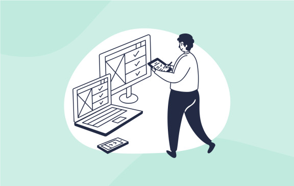
To ensure your website provides a smooth, enjoyable experience, it's crucial to implement key UX patterns that work. Below, we’ll dive into 19 essential UX patterns you need on your website, to boost user engagement, retention, and conversions.
1. Navigation Tabs

Tabs have been a fundamental element of user interfaces for decades, dating back to physical filing systems. Despite their long history, navigation tabs remain crucial for simplifying complex websites.
When your site has three or more main categories, each with multiple subcategories, using navigation tabs is a great way to keep the homepage clean and focused on promotions, featured products, or important announcements. By grouping similar pages under one tab, users can easily navigate to the sections they are interested in without feeling overwhelmed.
For instance, popular eCommerce platforms like Shopify or Etsy leverage this pattern effectively. They provide categorized tabs that simplify user journeys while ensuring that the homepage stays optimized for sales.

2. Easy Registration with Third-Party Sign-Ins
In today's fast-paced digital world, users expect convenience. One way to make registration hassle-free is by offering Lazy Registration, where visitors can browse without signing up immediately, only being prompted to register when necessary. But now, there’s an even simpler solution: Sign-in with Google or Facebook.
With users increasingly protective of their time, offering third-party sign-ins via Google, Facebook, or Apple has become essential. It allows users to create an account instantly, without filling out multiple fields or remembering yet another password.
Moreover, this feature also builds trust, as users feel more comfortable logging in through platforms they already use and trust.
3. Breadcrumbs: Navigational Comfort
Breadcrumbs are the small text path (e.g., Home > Blog > Articles) often seen at the top of a webpage. This simple navigational feature helps users track their location within a website, making it easier to backtrack several levels without hitting the “back” button multiple times.
Breadcrumbs are particularly useful when your categories are deeply nested. Whether you're running an eCommerce store with several product categories or a blog with multiple layers of content, breadcrumbs help users stay oriented and in control of their navigation.
4. Product Showcases and Galleries

For eCommerce websites, showcasing products effectively is critical. One of the best patterns for achieving this is through Product Galleries that offer Zoom and Pan features.
Zoom allows users to inspect product details closely, giving them confidence in their purchase by allowing them to analyze product texture, color, and material. Meanwhile, the pan feature helps users explore different angles of a product without switching between multiple images.
Luxury brands like Gucci and Rolex use these features to ensure that customers get a high-resolution, in-depth look at the craftsmanship of their products. This enhances the user experience and significantly reduces doubts that could deter a potential purchase.
5. Side-by-Side Product Comparisons
Another indispensable UX feature for eCommerce is the Side-by-Side Product Comparison. Customers often compare products by features, prices, and reviews before making a purchase decision. By offering this feature, your website allows users to make informed decisions without leaving your platform to conduct research elsewhere.
For example, tech retailers such as Best Buy and Amazon provide easy-to-use comparison tools where users can select several products and view their specifications, reviews, and pricing in a clean side-by-side layout. This keeps users engaged and prevents them from navigating away to a competitor’s site for better comparisons.
Additionally, displaying customer reviews and ratings prominently on comparison pages can further build trust, helping users understand product performance from real buyers.
6. Persistent Cart
How often have you added items to your cart, left the site, and returned to find your cart empty? A Persistent Cart addresses this frustration by saving users' selections, even if they navigate away from the page or close their browser.
This feature provides a seamless shopping experience by allowing users to pick up where they left off. It’s particularly beneficial for busy shoppers who might need more time to complete their purchase in one sitting.
Moreover, combining this with a Guest Checkout Option—where customers can make purchases without creating an account—can significantly reduce cart abandonment rates. This approach respects user time and convenience, encouraging quicker, smoother purchases.
7. Pagination and Infinite Scrolling

Pagination breaks up large volumes of content into manageable pages, which can make your website feel more organized and less overwhelming. It’s particularly useful for sites with extensive product lists, such as online retailers.
However, Infinite Scrolling is increasingly becoming a popular alternative, especially for websites with a constant flow of new content. This UX pattern ensures that new data (such as product listings or blog posts) loads as the user scrolls, rather than requiring them to click through numbered pages.
Websites like Pinterest and Instagram have popularized infinite scrolling, allowing users to browse endlessly without disruption. But note that this pattern works best when there is a continuous stream of new information; for more finite categories, pagination remains more practical.
8. Touch-Friendly Interfaces for Mobile Optimization
Mobile optimization is no longer optional. With over half of global internet traffic coming from mobile devices, it’s crucial to design websites that are responsive and touch-friendly.
Touch-friendly interfaces ensure that all buttons, forms, and interactive elements are easily accessible on a mobile device. This involves making sure elements are large enough to tap comfortably, spacing links appropriately, and avoiding clutter that could confuse mobile users.
For example, many mobile-friendly sites use thumb-friendly button placements and ensure that key actions (like “Add to Cart” or “Checkout”) are within easy reach at all times.
9. Responsive Design for Multi-Device Accessibility
Building on mobile optimization, your website must incorporate Responsive Design to adapt seamlessly to different screen sizes and orientations. Whether someone is browsing on a smartphone, tablet, or desktop, the experience should remain fluid, with no layout disruptions or awkward scrolling.
A responsive design ensures that images, text, and interactive elements adjust dynamically to fit the screen, enhancing the user experience on all devices.
Leading eCommerce brands like Amazon and eBay set the standard in responsive design, allowing their websites to cater to users regardless of device, thus maximizing user retention.
10. Personalized Recommendations

Personalization is a powerful way to enhance UX, and one of the best methods to do this is by offering Personalized Product Recommendations. By analyzing a user’s browsing history, past purchases, and behavior, you can suggest relevant products that meet their specific preferences.
Amazon’s recommendation engine is a prime example of this UX pattern in action. Every user sees a tailored list of products, helping them discover items they may not have found on their own, driving more sales and engagement.
In addition to recommendations, displaying a section for Recently Viewed Items helps users navigate back to products they may have forgotten about or are considering, reducing friction in their decision-making process.
11. Progress Bar
When a task on your website requires multiple steps—such as completing a purchase or filling out a form—a Progress Bar can help. This simple UX element reassures users by showing them how far along they are in the process and how much remains.
For instance, a progress bar during checkout not only reduces anxiety but also minimizes cart abandonment. It provides users with a clear visual of the process and encourages them to complete their actions.
12. Discoverable Hover Controls
In an age where minimalism reigns, Discoverable (Hover) Controls allow you to maintain a clean design while offering additional functionality when needed.
This pattern hides certain controls until they are needed—such as appearing when a user hovers over an image or button. For example, hovering over a product image might reveal additional purchase options or quick-view details, creating a more interactive and engaging browsing experience.
13. Fat Footer

The Fat Footer design, where you include links to major or featured pages at the bottom of every page, continues to be an essential UX pattern. Many websites now use their footer as a catch-all space for important but non-primary navigation, such as customer service links, policies, and social media buttons.
This pattern is particularly useful for eCommerce sites, where users might scroll to the bottom of the page to quickly find key information, like shipping policies or returns procedures.
14. Search Parameters
Search functionality is a critical part of UX design. After scanning the top menu, users will typically look for a search field to quickly find the products or information they need.
For eCommerce sites, offering search parameters—like price range, color, size, or availability—enhances the user experience by allowing users to filter their searches. This results in faster, more relevant results, minimizing frustration and keeping customers on the page for longer. Search features must be intuitive, quick, and yield accurate results. Offering options such as price filters, product categories, or best-seller filters helps users customize their search, making it easier to find precisely what they’re looking for. This enhances the shopping experience, especially for users who have specific preferences.
Leading marketplaces such as Amazon and eBay excel in providing dynamic search filters that adjust in real-time based on the products listed or selected. Their search interfaces ensure that users never feel frustrated with vague or irrelevant results, further encouraging conversions.
15. Conversational Interface
Building a conversational rapport with website visitors can dramatically improve their experience. A Conversational Interface uses language that is natural, friendly, and personalized. For example, when users receive messages like, “Welcome back, [Name],” or “Here’s what we’ve saved in your cart,” they feel more connected to the brand.
This pattern adds a human element to your website, building trust and making users feel more comfortable. By designing interfaces that use "you" and "your" consistently, your website becomes more than just a transactional platform—it becomes an interactive, customer-first experience.
This UX pattern is especially important for subscription-based services or platforms with frequent user engagement. Think of how Netflix or Spotify greets users with personalized messages that make them feel welcome and understood.
16. Hub and Spoke Navigation

A Hub and Spoke navigation pattern is useful when guiding users through a set of related options or actions. In this layout, a primary page (the “hub”) presents the main options, and each choice directs users to secondary actions or details (the “spokes”).
For instance, if you’re on a website shopping for shoes, the hub might show general categories like “Men’s Shoes” and “Women’s Shoes,” while the spokes allow users to narrow down their selection based on size, color, or style. This design keeps navigation clean, reduces cognitive overload, and makes decision-making easier for users.
Many large online retailers employ this approach to minimize clutter and guide customers to what they want without overwhelming them with too many options at once.
17. Primary Actions and Calls to Action (CTA)
Strong Primary Actions and CTAs are essential for driving conversions on any website. Whether it’s signing up for a newsletter, making a purchase, or downloading a guide, the CTA needs to stand out visually and be compelling.
Use bright, contrasting colors for your primary action buttons to draw attention, and ensure the copy is clear and action-oriented (e.g., “Buy Now” or “Sign Up Today”). Secondary actions (such as “Cancel” or “Go Back”) should be less prominent to guide users toward the desired outcome without overwhelming them.
For instance, Shopify uses large, bright buttons for its primary calls to action, ensuring that users can’t miss them. Coupled with simple yet persuasive copy, these buttons lead to higher engagement rates and conversions.
18. Recommendations Based on Behavior
Offering Personalized Product Recommendations isn’t just a bonus—it’s becoming a necessity in modern UX design. By tracking user behavior and preferences, you can display products that align with their interests, making their shopping experience more intuitive and enjoyable.
Amazon, for example, uses an algorithm to suggest products based on previous purchases or searches, which helps users discover items they might not have otherwise considered. This level of personalization enhances customer satisfaction and drives up sales.
Similarly, displaying recently viewed items helps users quickly return to products they were previously considering, minimizing frustration and helping them complete their purchases.
19. Visual Framework for Consistency

A consistent Visual Framework is critical for building a cohesive and recognizable brand identity. When users move between pages on your website, the overall design should remain familiar, with consistent elements like color schemes, typography, and iconography guiding them through the experience.
For example, Apple maintains a clean, minimalist design across all of its platforms and devices. Whether users are browsing the Apple Store or exploring product features, the visual consistency reassures them they’re in the right place and enhances the overall user experience.
Conclusion
Creating a seamless and enjoyable user experience requires careful consideration of the right UX patterns. From simple navigation and personalization features to more advanced elements like touch-friendly interfaces and persistent carts, your website should cater to the needs and preferences of your visitors at every step.
Incorporating these essential UX patterns into your website design can significantly improve user engagement, reduce cart abandonment, and ultimately drive more conversions. As you implement these patterns, remember that UX is about making your visitors feel comfortable, informed, and valued—so they come back time and time again.
What UX patterns have made the biggest impact on your website’s success? I’d love to hear your thoughts! Share your experiences or any additional tips in the comments below and let’s start a conversation. Your insights could help others enhance their own websites!


Best regards
Maria Luisa Morales