

Key takeaways
- Rank your fixes by what they cost you, not by what gets written about. Message match, a visible total cost and a single action are free and reversible by lunchtime. Proof takes weeks. Page weight usually needs a developer.
- Cold ad traffic is almost entirely new visitors, and new visitors convert at 1.7% against 2.9% for returning ones across Contentsquare's 99 billion sessions. Closing that gap is the whole job.
- The highest-yield thing you can add to the page is a shipping number, not a testimonial. Baymard puts 40% of abandoners on extra costs and another 12% on not being able to work out the total up front.
- Strip the navigation. One action, repeated as many times as the page is long, every competing exit removed. Then watch add-to-cart rate rather than bounce rate.
- Proof is the one lever you cannot move today. A single named review answering a specific objection does more for a stranger than the star average sitting above it.
- Speed ranks fifth because it is so often already fine. Ordo's flosser page passes Core Web Vitals at 1.5 seconds on mobile and still quotes its free-delivery threshold in pounds to American shoppers.
Ordo sells its Hydro Sonic water flosser to American shoppers for $63.99. Under the buy button, on the same screen, the page promises free delivery when you spend £35. That is about $47, and the page does not do the sum for anybody. Meanwhile it passes Google's Core Web Vitals on mobile at 1.5 seconds. Speed is the lever most sellers work on. Here it is the one lever already fine.

Why cold traffic is the hardest traffic you will ever pay for
Every landing page guide on the internet takes apart Casper, Dollar Shave Club and Apple. Those teams have a research panel and a designer on staff. They also have a brand the visitor recognizes before the first image finishes decoding, and that recognition does more work than anything on the page. You get none of it. Your visitor came from a cold ad. They have never typed your store name. They are weighing up whether to hand $64 to strangers.
Contentsquare's Digital Experience Benchmark for 2026 is drawn from 99 billion web and app sessions across more than 6,000 sites, comparing the fourth quarter of 2025 against the same quarter a year earlier. It puts new visitors at a 1.7% conversion rate and returning visitors at 2.9%. So a first-timer is worth about six tenths of a repeat buyer before your page has said a word. Closing that gap is the whole job. It is also why advice written from Casper's page transfers so badly. Casper can spend its first screen on typography, because the trust question got settled somewhere else years ago. On your page the trust question is the only question.
Which changes what a landing page is for. It is not a showroom. It is the twenty seconds in which somebody with no reason to believe you decides three things: whether the product arrives, what it really costs, and what happens if it is wrong.
Three tiers, five levers, one pile of decoration
Here is the taxonomy the rest of this page runs on. Five levers, sorted into three tiers by what each fix costs you. Cost is the part every ranked list leaves out.
Tier one, the answerable questions. What did you promise, what does it really cost, and what is the one thing to do. All three are free, and all three are reversible by lunchtime.
Tier two, the earned signals. Proof. You cannot buy this honestly and you cannot ship it this afternoon.
Tier three, the physics. What the page weighs on a phone. This one costs tooling or a developer. On a well-built Shopify theme it is often already solved.
Everything else is the decoration pile. It gets its own section further down, priced honestly rather than dismissed.
| Lever | Tier | The check you run | What the fix costs |
|---|---|---|---|
| 1. Message match | One | Read your top-spending ad's headline against the page's first line, out loud | Ten minutes, no money |
| 2. Real total cost | One | Answer price, shipping and arrival date on a phone without scrolling past the second screen | An afternoon of buy-box edits |
| 3. One action | One | Count every clickable thing on the page that is not the buy button | One toggle on a duplicated theme template |
| 4. Believable proof | Two | Name the claim a skeptic challenges first, then find the evidence that settles that claim | Weeks, because reviews get earned |
| 5. Page weight | Three | PageSpeed Insights, mobile tab, Largest Contentful Paint | A compression pass over your product photography |
Work down it in order. If your own numbers already point somewhere, start there instead. Healthy sessions with an add-to-cart conversion rate under 2% is almost always lever one or lever two, not design. A mobile rate under half your desktop rate is lever three or five. And revenue that fell after you changed eight things at once is not a lever at all. That one is a rollback, plus a change log with dates in it.
Tier one: the three checks a stranger runs in the first screen
Lever 1: does the page repeat the promise that earned the click?
The ad, the email or the TikTok caption made a promise. The first line of your landing page has to make the same promise, in more or less the same words. Break that and nothing underneath it matters. You have asked somebody to decide twice, and the second decision is the one they walk away from. It is the cheapest fix on this page. In every store audit I have sat in on, it is also the one nobody had run.
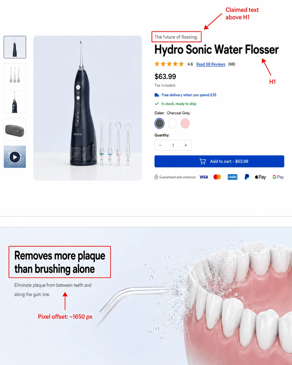
Ordo's page is a clean example of the near miss. The line above the product name reads "The future of flossing." The H1 reads "Hydro Sonic Water Flosser." Neither is a promise a plaque-focused ad would have made. The sentence that is, "Removes more plaque than brushing alone," sat about 1,824 pixels down the page when it was measured in Chrome at 1440 by 900 on 6 August 2026. Call it two full screens below the buy button on a laptop, and further on a phone.
Your check takes ten minutes. Open your ad manager, sort by spend, and copy the headline of your top three ads into a document. Under each one, paste the first visible line of the page it points at. Read the pairs out loud. Any pair making two different promises gets the page headline rewritten to match the ad. Today, before you touch anything else on the store.
You can run the same check on a competitor. Every advertiser's live creative is public. Search the Meta Ad Libraryfor your category and you get the primary text of everything currently running. A search for "water flosser" in the United States returned roughly 1,200 active results on 6 August 2026. One of them, from PuurSmile, opens "SUMMER KICKOFF SALE IS LIVE: 55% OFF + 4 FREE GIFT BUNDLE!" Click through and you can see whether the discount survives the trip.
If rewriting the headline is the part you dread, writing product descriptions that sell has the templates.
Lever 2: can they work out the total before the cart?
The price the shopper will actually pay, shipping included, belongs on the landing page rather than two steps further in.
Baymard Institute's running tally of 50 cart-abandonment studies, last updated 22 September 2025, puts the average documented abandonment rate at 70.22%. Then it asks why.
.webp)
In Baymard's own 2026 survey of 1,083 US adults who had shopped online in the previous three months, among those who abandoned for a reason other than browsing, 40% say the extra costs of shipping, tax and fees were too high. Another 12% say they could not see or calculate the total order cost up front. So the highest-yield thing you can add to a landing page is not a testimonial. It is a shipping number.
Why shoppers abandon checkout
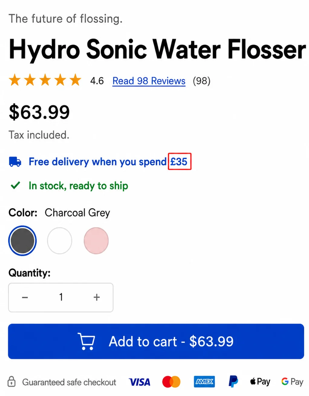
Ordo does the hard half of this well and then undoes it. The button carries the price, "Add to cart - $63.99", so the number sits inside the click rather than behind it. Above the button is a real delivery window: "Get it between Sunday August 9 - Monday August 10". That is more than most stores manage. Then the free-delivery threshold underneath reads £35, or roughly $47. The currency selector says USD. The price is in dollars. The button is in dollars. An American shopper cannot act on that line without opening a second tab.
Ordo fails its own version of that test, incidentally. Load the same page in a 390 by 844 phone viewport and the first screen gives you the product shot, the name, the tagline, the price and the rating. The shipping line and the arrival date are both below the fold.
Your check: load the page on your own phone, in a private window, and answer three questions without scrolling past the second screen. What does it cost? What does shipping cost? When does it arrive? Any answer that takes more than one scroll gets moved into the buy box today.
Free shipping only works if your landed cost supports it. That comes down to what your supplier charges, not what you hope they charge. Doing it manually means sending the same three questions to several suppliers, on the same SKU, at the same quantity. Then waiting. The slow part is never writing the emails. It is the ones who never reply, and the ones whose quote arrives with no freight line in it. A pre-vetted directory such as the SaleHoo Directory changes what you are waiting for rather than promising you a stopwatch: the contact, the dropship terms and the minimum order are already on the listing, so the comparison starts at the quote instead of at finding somebody to quote. Either way, get the number before you promise anything on the page. If shipping is already eating your margin, the shipping mistakes that quietly cost sales is worth twenty minutes.
Lever 3: is there exactly one thing to do?
One action, repeated as many times as the page is long, and every competing exit removed. A homepage routes people. A landing page converts the single intent that brought somebody there. Every extra link is a small invitation to go and do something else. Your header menu is the worst offender. It is there because your theme put it there, not because you decided it should be.
Ordo's product page carries the full site navigation: Toothbrushes, Collabs, Water Flossers & Essentials, Brush Heads, Summer Sale, About & Help. Six items. Above them, on 6 August 2026, sat an announcement bar reading "Up 30% off: Shop Summer Sale". So a shopper who came for a flosser now has seven ways to stop shopping for a flosser. The two sale links are the most tempting of them, because they quietly teach a first-time visitor that waiting gets rewarded.
.webp)
Your check: count every clickable thing on the page that is not the buy button. Header links, footer links, social icons, related products, chat widgets, blog links. Anything above five should go. On Shopify, duplicate your product template, switch off the header and footer navigation on that copy only, and point half your ad traffic at it for a week.
Watch add-to-cart rate, not bounce rate. A stripped page usually shows a worse-looking bounce rate and a better-looking revenue number. The people who used to wander into your blog now either buy or leave. Only one of those two ever paid you anything.
.webp)
Tier two: proof you cannot buy in an afternoon
Lever four is evidence from people who are not you, specific enough that faking it would be more work than earning it. It sits in its own tier for one reason. It is the only lever here you cannot move today, and pretending otherwise is how stores end up with imported review carousels that read as imported.
Ordo has fixed this one since the last time this page was written. The US listing now shows 4.6 stars and a "Read 98 Reviews" link. The UK listing shows the same 4.6 from the same 98. That is a real change and worth naming, because it is the shape earned proof takes when it finally lands: a number, a count, and a link that goes somewhere.
.webp)
And it still does not settle the question the page most needs settled. A 4.6 average tells a stranger that other people bought this. It does not tell them the tank survives a suitcase, that the charge really lasts four weeks, or that a refund is possible when it does not. Those are the objections a $63.99 purchase from an unfamiliar store actually raises. They get answered by individual reviews carrying a first name, a purchase badge and a photograph, which is why the link matters more than the average. Baymard's data makes the same point from the other end. In that same abandonment survey, 19% of the people who walked away said they did not trust the site with their card details. No star average has ever fixed that.
So the useful question is not how many reviews you have. It is this: which claim would a skeptic challenge first, and what settles that specific claim? Review count settles "do other people buy this." A photograph of the product on a real bathroom shelf settles "does it look like the render." A named dentist settles "is this safe for my gums." A returns policy in plain words settles "what if I am wrong." A generic five-star carousel settles nothing, because every store on the internet already has one.
.webp)
One honest warning before you go shopping for a reviews app. Import reviews only if they are genuinely for the product you are selling. Mismatched imports are the fastest way to look like a dropshipper, and shoppers catch them instantly on the wrong product name sitting inside the review text. The badge version of the same instinct mostly does not work either. The trust badges that actually convert sorts the few that survive contact with real shoppers from the many that do not.
Tier three: what the page weighs on a phone
Now the lever everybody starts with, arriving fifth.
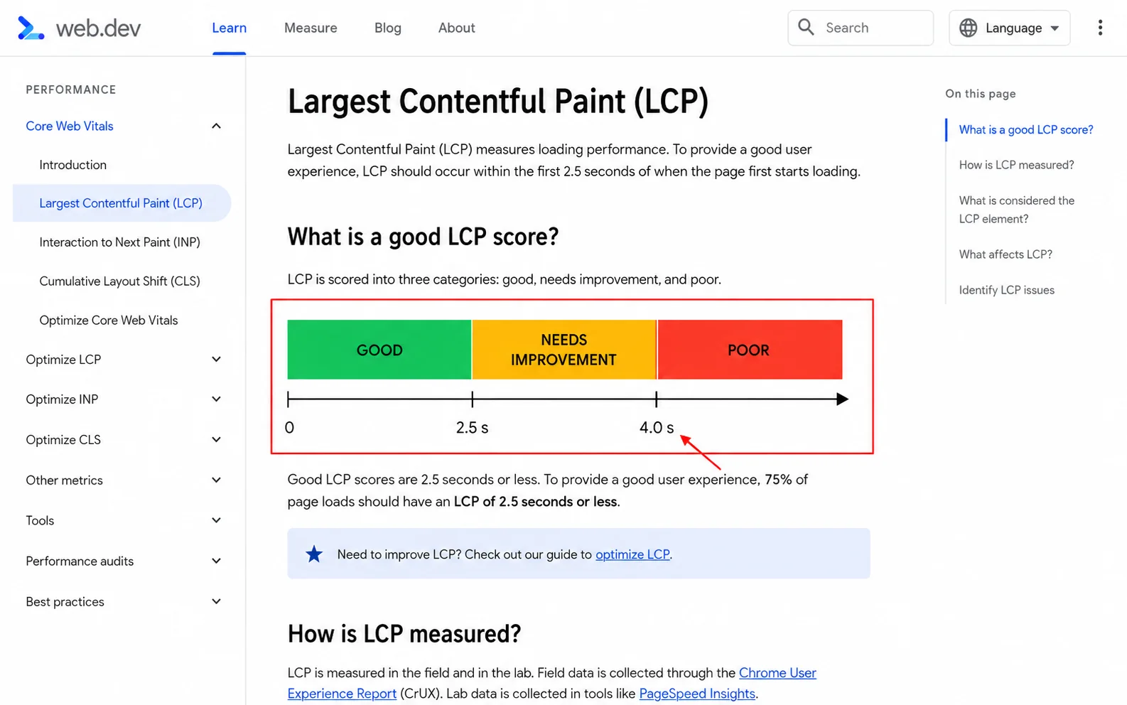
Google's Core Web Vitals guidance on web.dev, last updated 4 September 2025, sets the thresholds. A Largest Contentful Paint of 2.5 seconds or less is good. Anything over 4.0 seconds is poor. And you judge yourself at the 75th percentile of real page loads, split between mobile and desktop. That is where the "under 2.5 seconds" figure in every speed article comes from. Worth knowing it is Google's line, not folklore.
The weight itself is mostly pictures. The HTTP Archive's Web Almanac for 2025, published 15 January 2026, puts the median mobile page at 2,362 KB. Images are 911 KB of that. JavaScript is 632 KB. So images are the largest single line item by some distance, and the only one you can fix without touching code.
What a median mobile page actually weighs
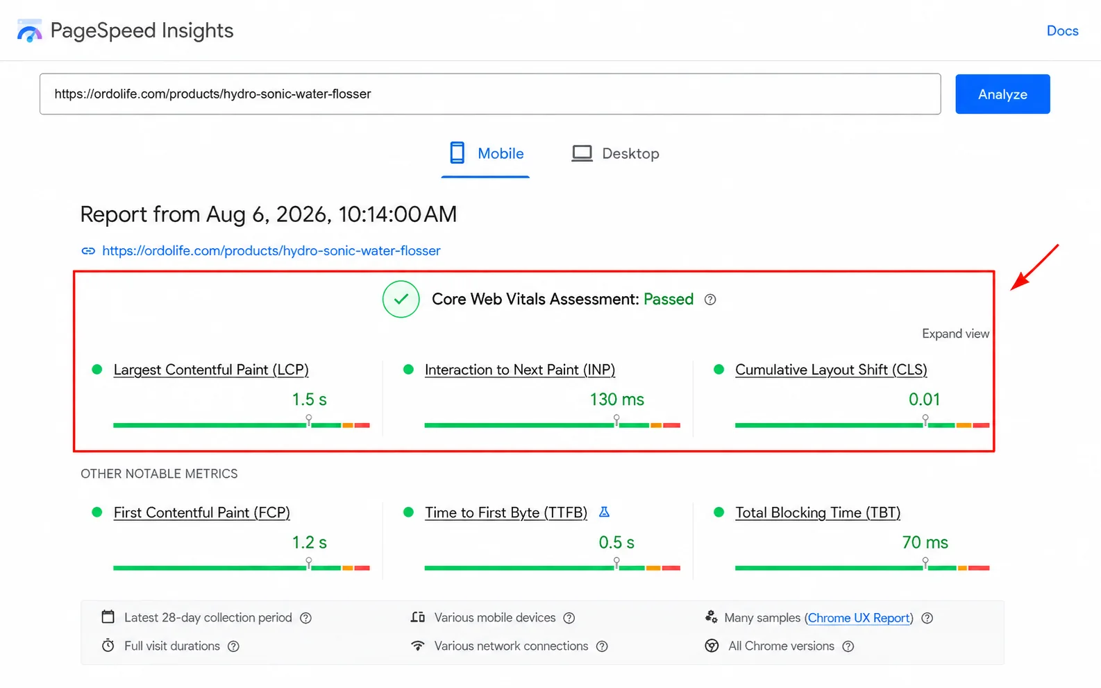
Here is where the running example stops being a cautionary tale. Run Ordo's US flosser page through PageSpeed Insights, mobile tab, and it passes. Largest Contentful Paint 1.5 seconds. Interaction to Next Paint 130 milliseconds. Cumulative Layout Shift 0.01. All of it Chrome User Experience Report field data from real visitors over the previous 28 days.
So a store whose highest-value page quotes the wrong currency has already solved the technical problem everybody blogs about. That is the ranking argument, made by somebody else's page instead of asserted by me.
Your version of the check takes two minutes. Put your landing page URL into PageSpeed Insights. Read only the mobile tab. Look at Largest Contentful Paint before anything else on the report. Under 2.5 seconds? Close the tab and go back to lever one, because you are optimizing something already fine. Past four seconds? Open your browser's network panel, sort the image requests by size, and compress everything over 200 KB before you buy a faster theme. Product photos that convert covers exporting at the right size in the first place, which is far easier than fixing it later.
The decoration pile, priced honestly
Four things absorb most of the attention in landing page advice and return almost none of it. Ranked by how much time I would give each one, which for three of them is none.
Color psychology. Red does not create urgency. Blue does not create trust. What a button color creates is contrast, and contrast is real and measurable. Pick a color that appears nowhere else on the page, then stop reading articles about what orange means. The version of this with evidence behind it is about how people make buying decisions rather than about wavelengths, and the psychology of why people click buy is the useful half of that literature.
Typography. Readable is the entire specification, and two thirds of it is a published standard rather than taste. The W3C's WCAG 2.2 sets the minimum pointer target at 24 by 24 CSS pixels, under Success Criterion 2.5.8 at Level AA. It caps line length at 80 characters, under Success Criterion 1.4.8 at Level AAA. The 16-pixel minimum body size everybody quotes, including me, is not in the standard. That one is a rule of thumb. Treat it as a default rather than a requirement, and test it on an actual phone. eCommerce typography goes deeper, and I would still put all of it behind the five levers above.
"Everything above the fold." Actively harmful, and the previous version of this page repeated it. Cramming price, proof, benefits, guarantee and CTA into one screen produces exactly the overcrowded mess that costs more sales than a second screen ever did. Use two screens. Repeat the button. The fold is where you make the promise, not where you finish the argument.
Countdown timers and fake scarcity. A timer that resets when you reload is a lie, and your buyers do check. Real deadlines work. Invented ones cost you the trust the rest of the page was built to earn, and they are the clearest single tell that a store is running a template. Ordo runs no timer at all. It runs a delivery date instead. Same pressure, and it happens to be true.
FAQs
Compare yourself against your own last month rather than a benchmark. If you want an outside number anyway, Contentsquare's 2026 benchmark puts new visitors at 1.7% and returning visitors at 2.9%, across 99 billion sessions. A cold-ad landing page is almost entirely new visitors. So 1.7% is the honest bar to beat.
No. Strip it. A landing page has exactly one action and the header menu is the most-clicked way to avoid it. Keep a small footer carrying returns and contact links so the page still reads as a real business, and remove the rest.
Once per screenful is a reasonable rule and it matters more than placement does. The old "primary CTA above the fold" instruction is what pushes people into cramming. Repeating the button as the visitor scrolls solves the same problem without the crowding.
Your product page is fine to start with, as long as you strip the navigation and match the headline to the ad. Build a separate page once you are running more than one distinct offer, because that is the point at which one page can no longer say the same thing every ad said.
Google's threshold is a Largest Contentful Paint of 2.5 seconds or less, at the 75th percentile of real mobile loads. Anything past 4.0 seconds counts as poor. Images are the usual cause. The HTTP Archive puts them at 911 KB of a 2,362 KB median mobile page, so compress your photography before you go shopping for a faster theme.
Fewer than you think. The count matters less than what the individual reviews say. Ordo's flosser sells at 4.6 from 98 reviews, but a store with six reviews that each answer a different objection, with a photo attached, is in better shape than one with ninety that all say "great product." Until you have any, put the proof you do have on the page: a delivery window you can hit, a returns policy in plain words, and one photograph of the product somewhere other than a studio.
It helps. It is not where most of your money is. Ordo's page passes on mobile at 1.5 seconds and still quotes its shipping threshold in the wrong currency for the market it sells to. Fix the currency first.
Two headline pairs, one that passes and one that does not
Here is the whole test, run twice, so you know what you are looking for on your own store.
A pair that fails. Ad headline: "Removes more plaque than brushing alone." Page first line: "The future of flossing." Both sentences are fine. They are about different things. A visitor who clicked on plaque now has to work out for themselves that this is the same product, and that is a job you have handed to somebody who owes you nothing.
A pair that passes. Ad headline: "Removes more plaque than brushing alone." Page first line: "Removes more plaque than brushing alone. $63.99, free delivery over $35, arrives Monday." Same promise, same words. The three questions from lever two get answered in the same breath. Nothing was invented and nothing was designed. A sentence already sitting two screens down moved to the top, and three facts were added to it.
That second version took one edit and no money. It outranks every other change on this page. So go and pull your highest-spending ad and the page it points at, put the two lines side by side, and tell me in the comments which one you had to rewrite, the ad or the page?
About this article
About the author